

How to Choose Dried Flower Bouquets That Complement Your Home's Color Palette
The biggest dilemma you can face when you fall in love with a particular bouquet is to bring it home and find a vase just to realize that it doesn't work with your olive-green wall. Moreover, what should you do if your living room already has five colors competing for attention? That's where I come in. With over a decade of experience in interior design and styling, I'll walk you through some basic principles of color theory and give you some useful tips on how you can choose dried flower colors that’ll suit your home.
Understanding Color in Dried Flower Arrangements
Monochromatic Colors

These arrangements feature different shades and tints of the same color. For example, in the image above, you can see beige, cream and tan. They all belong to the same color palette and make an arrangement look coordinated without bringing in much contrast.
Analogous Colors

The colors in this combination sit next to each other on the color wheel. Yellow, yellow-orange and orange are one common example of this type. You can use a similar combination like the image above to create a bouquet with colors that blend naturally into one another.
Complementary Colors

These colors sit opposite each other on the color wheel, such as green and red. They create contrast so I’d suggest using this combination only when you want your dried flower arrangement to stand out.
Best Dried Flower Colors for Different Interior Palettes
Warm Neutrals and Earthy Tones

If your home has beige/cream walls and wooden furniture, I’d highly recommend checking out pampas grass and sola flower arrangements; particularly in natural shades of beige, tan, ivory and brown. Since these monochromatic colors sit comfortably alongside the warm neutrals in your home, they won't make your space feel too busy. Living room corners or entryways are good placement options here. However, if you really want a dash of color, explore muted orange or pale pink arrangements.
Cool Neutrals and Soft Pastels

If you live in an apartment, chances are that your home has gray walls and white furniture. Cool-toned decor such as these work great with pale pink, lavender, dusty blue and cream flower arrangements. If you ask me, I'd choose two or three shades that already appear in your space and ensure that they are featured in the arrangement. Like, for example, a bouquet of pale pink and cream flowers will complement your gray sofa which already has blush-colored cushions as accent. You can also use a monochromatic palette here if you prefer a more coordinated look. Try combining different shades of the same color rather than adding several unrelated colors to the same vase (see image above).
Matching Bouquets with Walls, Furniture and Textiles
Remember, the colors around your vase (decor, wall, furniture) massively affect your arrangement’s appearance. Here are a few things I cross-check when selecting my bouquets:
-
Wall Color: If your walls are white or beige, you have plenty of room to experiment (dark or light). For darker colored walls, opt for lighter colored arrangements since they stand out better.
-
Furniture: Look at the largest piece of furniture nearby. For instance, if you have a brown wooden console, a cream and beige arrangement will look better since it's complementary.
-
Textiles: Take a look at your cushions, curtains and rugs. Go for bouquets that feature the accent colors of these decor pieces.
-
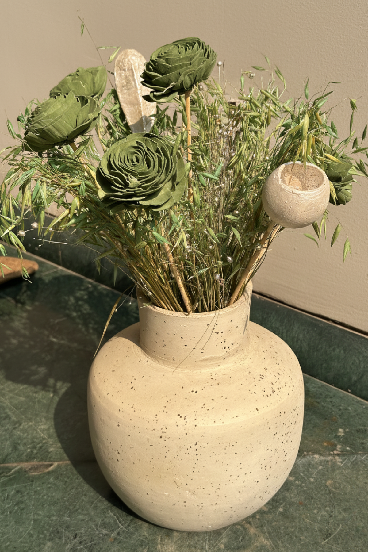
Vase Color: Probably the most important of them all, a cream bouquet in a cream vase will have a different vibe than the same bouquet in a dark brown vase. For more details on how you should choose your vase and arrangements, read our blog here.
-
Final Check From A Distance: An arrangement that looks good up-close might look out of place from a distance. So, always back away, like 20m or so, to look at your arrangement and make sure that it looks good and doesn't feel too busy in the chosen place.
How to Combine Different Dried Flowers Without Clashing

You don't need to use flowers of the same type or color throughout your arrangement for it to make sense. One easy approach to connect the different dried flowers is to choose a main color and then add one or two colors that complement it. For example, you could combine cream pampas grass with muted pink and brown dried flowers. Here, the cream acts as a neutral base while the other colors add variety.

If you prefer a bolder arrangement, try complementary colors. Green and orange can create a noticeable contrast while purple and yellow can make a bouquet feel more colorful. I’d keep the rest of the arrangement fairly simple (use beige, cream or brown hydrangeas or baby’s breath) so the contrasting shades don't compete for attention.
Choosing Bouquet Colors for Seasonal Décor
-
Spring: Pale pink, cream, lavender

- Summer: Yellow, orange

- Autumn: Rust, brown, beige

- Winter: White, cream, muted red

P.S. You don't have to replace your dried flowers every season. You can keep a neutral pampas grass arrangement as base and change some smaller decorative pieces or stems in the bouquet to match the season.
Color-Matching Mistakes to Avoid
-
If every flower has a different color, the arrangement will look disconnected. Start with two or three related shades and add more only if they work with the overall palette.
-
Your bouquet doesn't have to be the same color as your cushions, curtains or walls. A little contrast or using the accent colors in your decor can make the arrangement easier to notice.
-
The vase is part of the arrangement so always check that its color and shape work with your dried flowers.
-
A bouquet can blend into a wall or piece of furniture if the colors are too similar. Try a lighter or darker shade if you want the flowers to truly stand out.
-
A flower might look lovely on its own but feel out of place in your room because it was chosen in isolation. If possible, always compare its color with the furniture and textiles near where you plan to display it.
Explore Dried Flower Bouquets at Coastal Habitat
At Coastal Habitat, you can explore our dried flower collection to find stems that suit your home's color palette. I'd suggest starting with the colors already present in your room, then choosing flowers that either complement them or create a little contrast. In case you want to sort out your vase and flowers together, take a look at our vases and bunches collection.
P.S. We ship orders world-wide. Get in touch if you have any questions!
Final Thoughts
Start by looking at the colors in your room before choosing dried flowers. As mentioned above, I recommend paying attention to your vase, furniture and wall color before settling on an arrangement. Just use the principles here as a guide, experiment with different combinations and see what works in your space.
